BRANDING
March 2021
Client: DOSO Los AngelesCreating a logo and label tag for a clothing brand that focuses on lounge wear and athleisure. The only thing asked of me was to create something trendy and modern, while still easy to read. Keeping in mind that “doso sil” means library in Korean, I decided to go with either a narrow serif or a rounded grotesque sans serif. Below are the three options given (and after another round of discussions, we decided to go with Option A).
March 2021
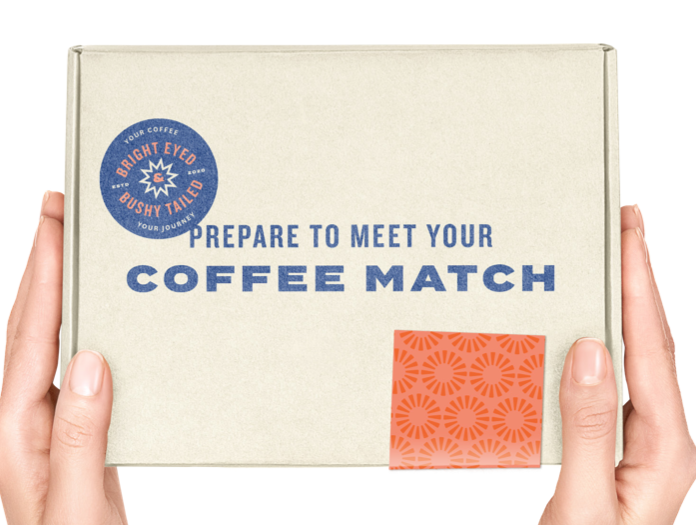
Client: Frank La | Be Bright CoffeeRedesigning a business card for client.
The Original
Client sent over their previous business card from a different designer, and asked for something a little more fresh and modern looking.


The Inspo
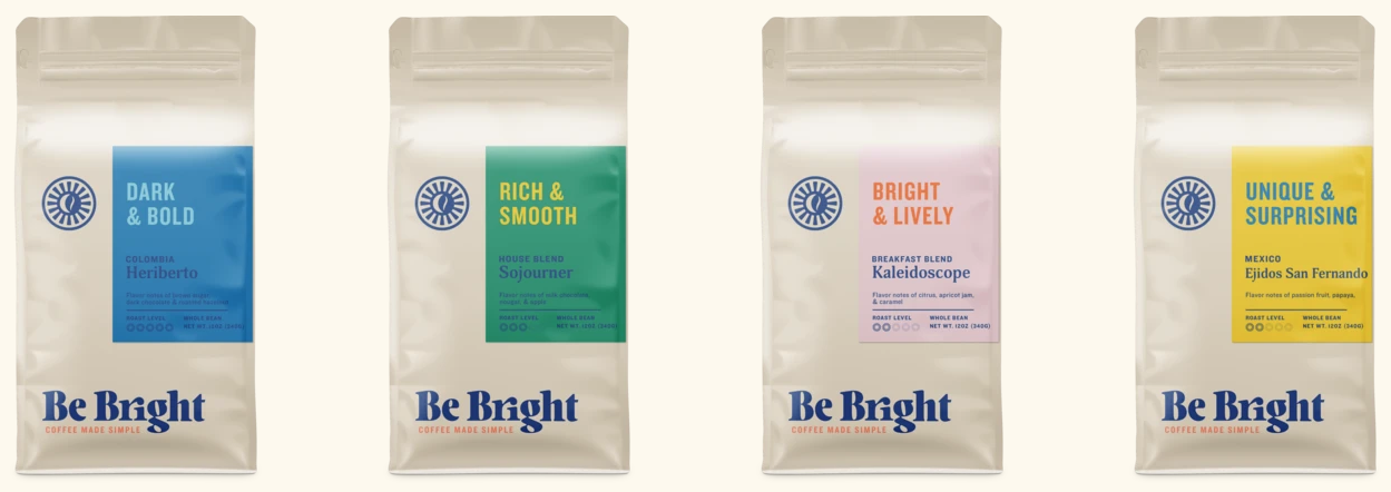
I took a look at how their product was being presented through packaging on their coffee bean bags and delivery boxes.
I noticed a lot of bright colors, and camp-y, sticker-like details.
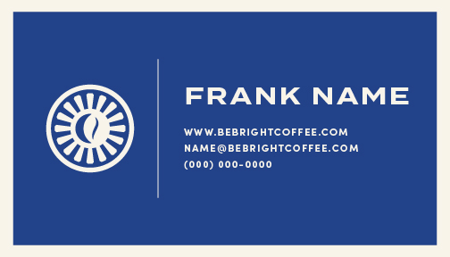
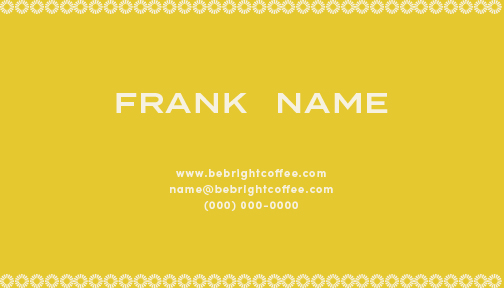
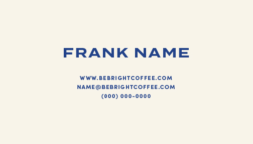
My Designs
I created three different designs.
01 — Clean and modern, using the dark navy to create stark contrast with the pale beige that is used frequently on their packaging.
I wanted their logo and watermark to take the center stage for this design, with a simple border and white line as the only other embellishments in the design.

02— Simple but brighter, to really give the effect of their brand name!
The yellow is so cheerful, and there is just a hint of the pattern they use on their packaging and website background.

03— My personal favorite, a simple and clean design that directly takes after their box packaging.

November 2020
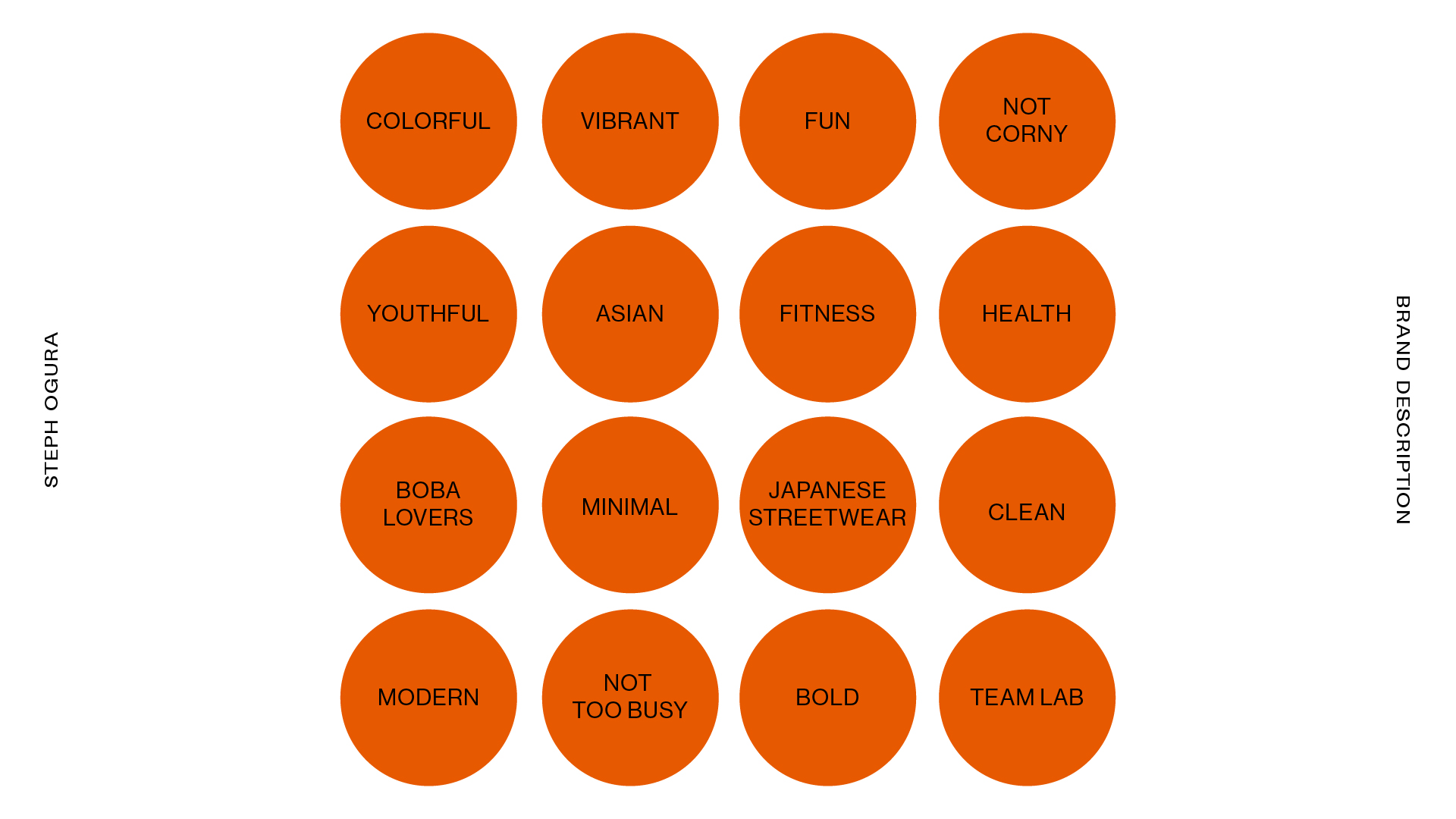
Client: Shawn Berg | Bubble BrewCreating a logo and color palette for a new protein shake brand.
Mood Board
Client sent over inspiration images and websites that inspired his branding, from which I created an image mood board.
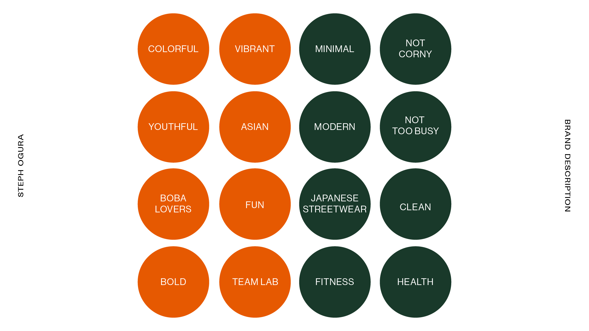
We also had a phone call and a few email threads discussing key descriptors for his brand, which I compiled visually in bubbles.
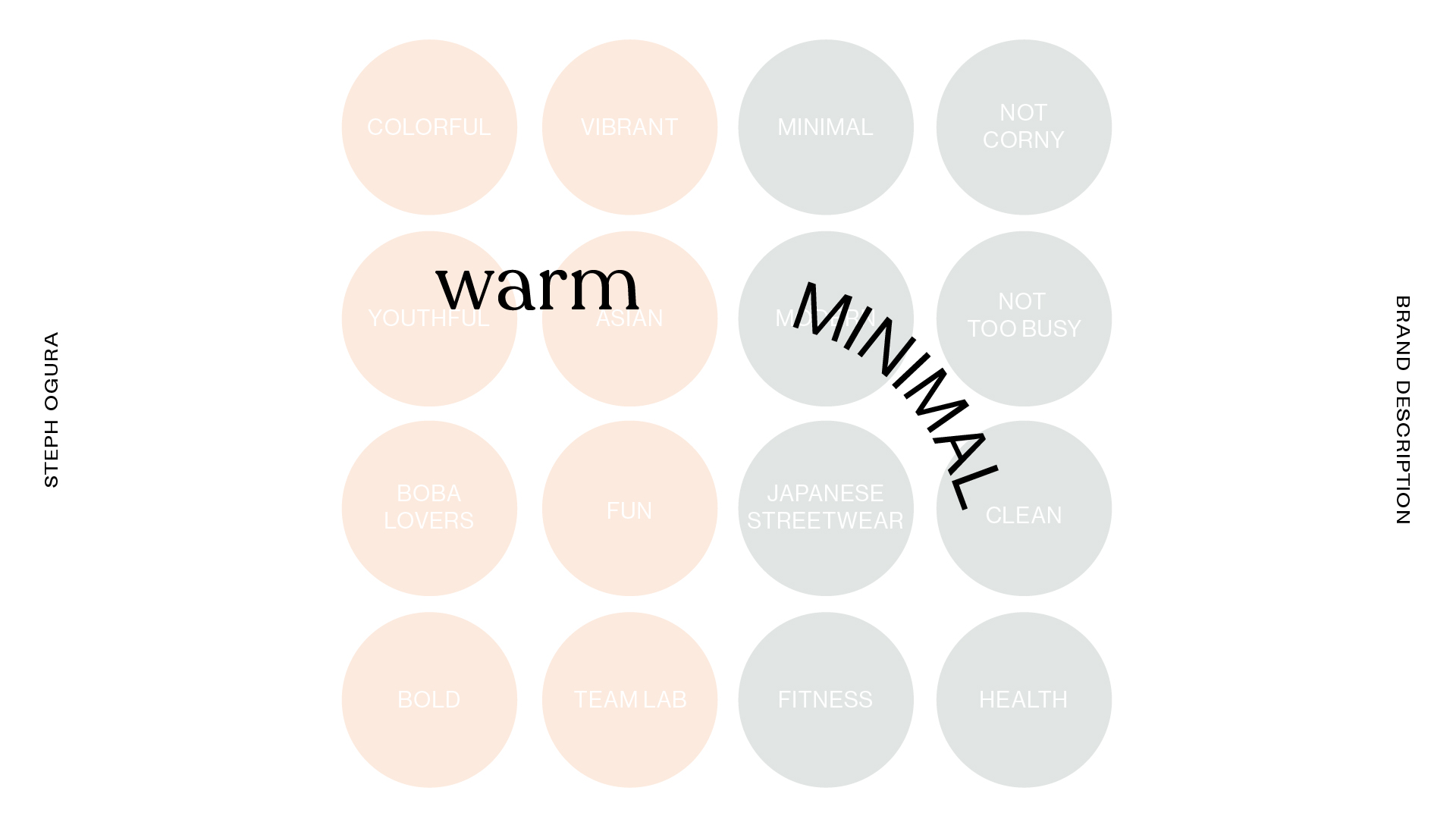
From there, I separated the words into two categories and called one “warm” and the other “minimal”.
This process helped focus the direction of the branding and logo design.

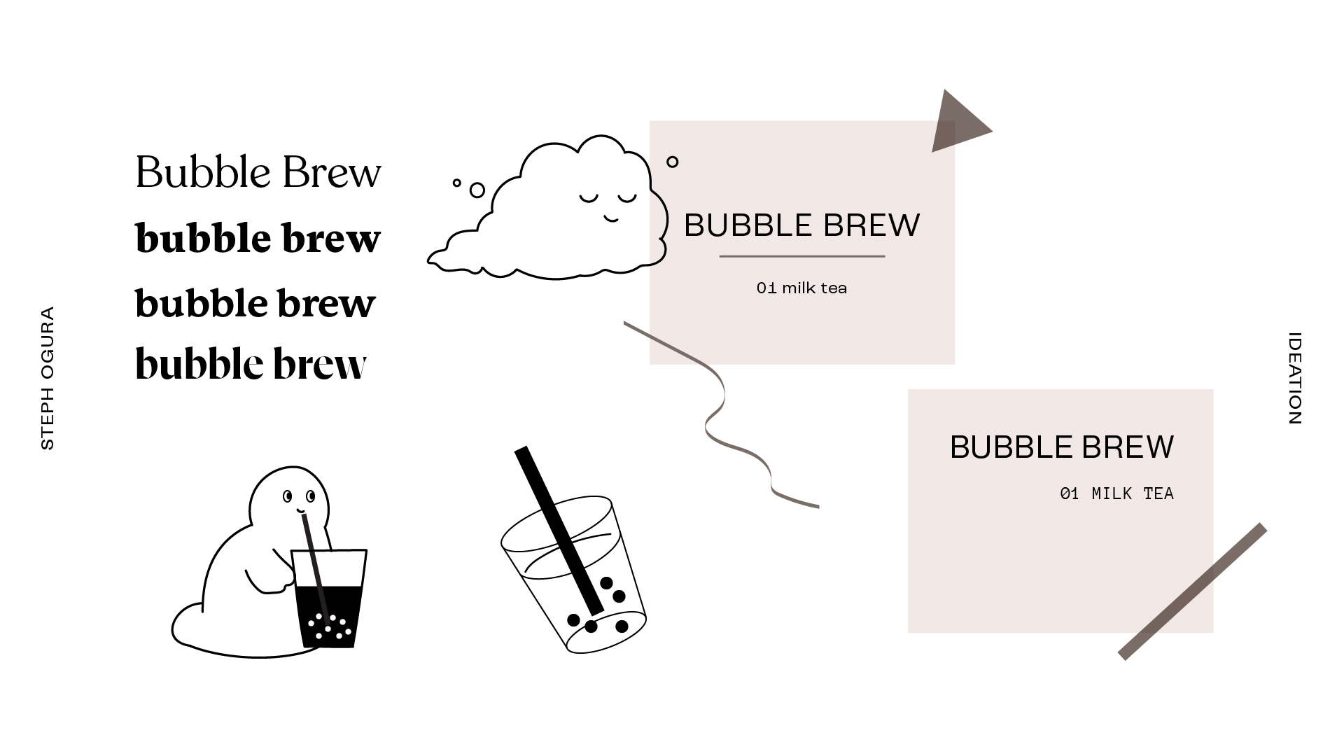
Ideation
I sent the client a few different ideas based off of the image and word mood boards. This is a sampling of what was sent over.
On the left are some of the logos in a more rounded serif typeface to represent the “warmth” portion of his branding.
They are accompanied by drawings that add additional warmth and character, and if included with the logo, could be used as a favicon / image logo.
On the right are logos that are more upscale and minimal, favoring sans serif typefaces paired with monotype typefaces, geometric shapes, and squigglies.
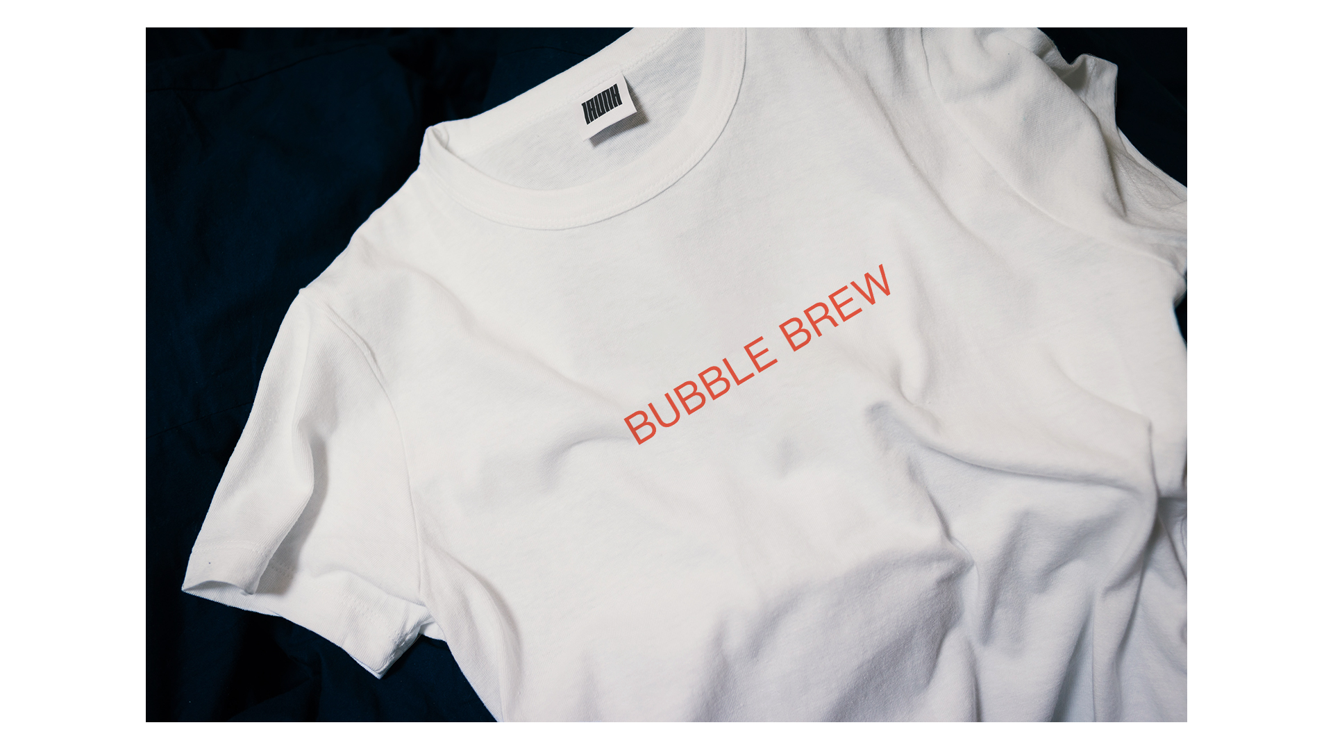
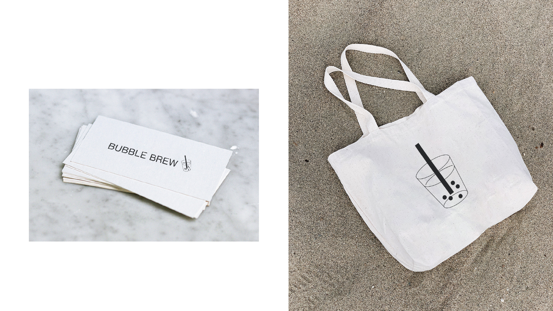
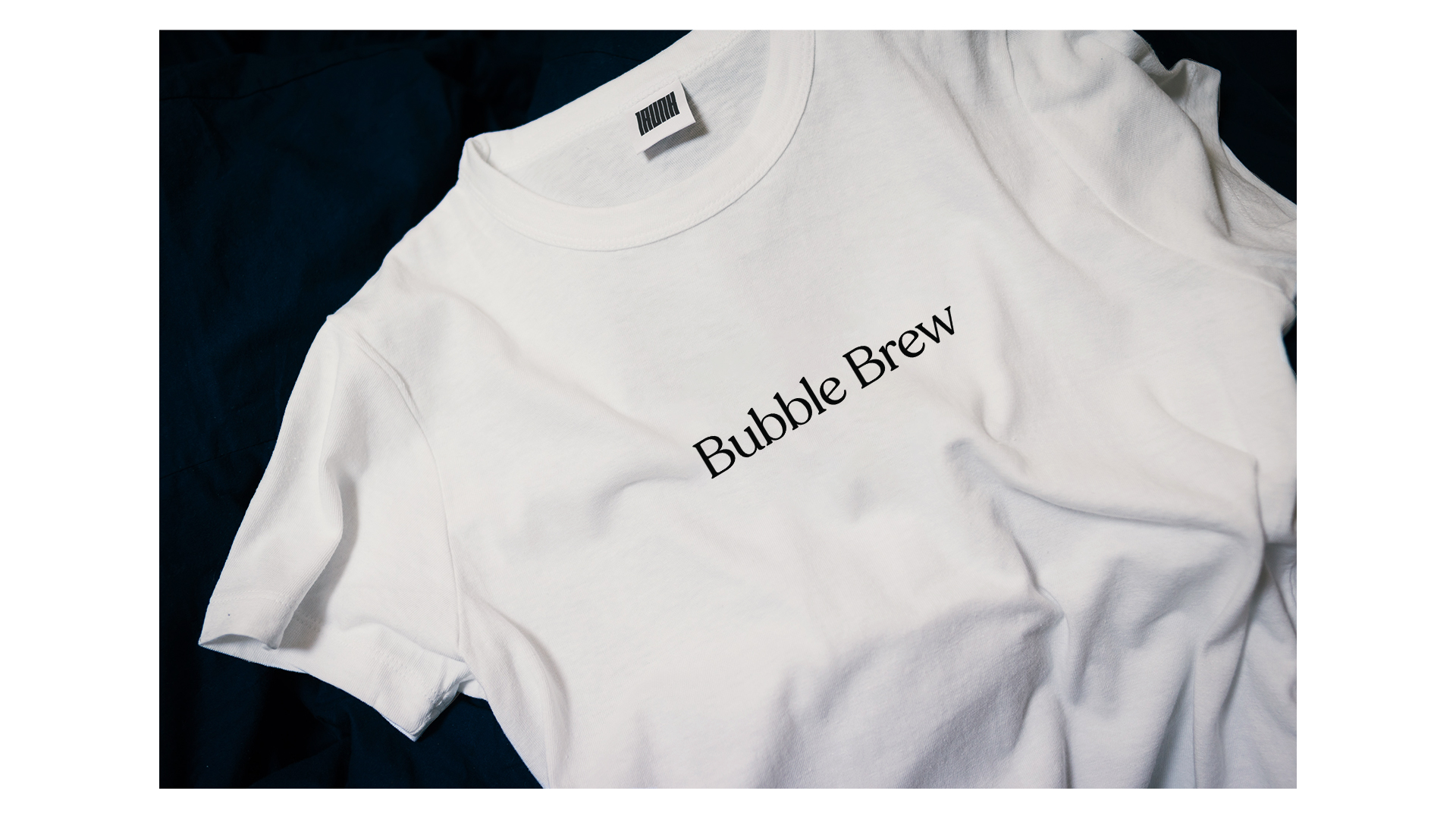
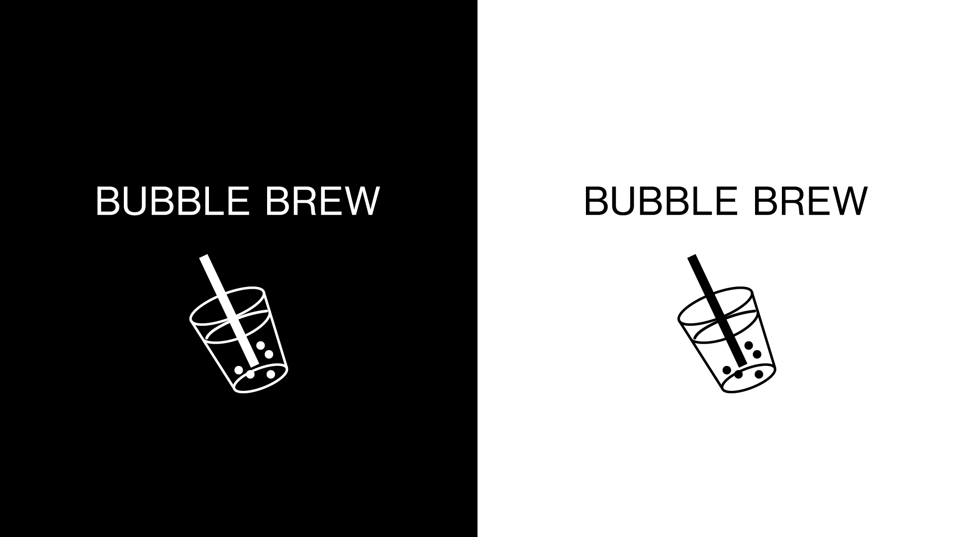
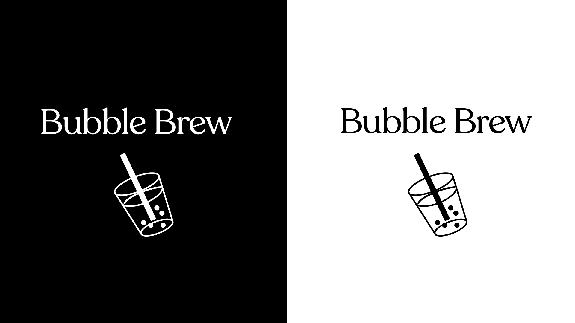
Finals
The final two logos presented to the client, shown on a variety of mo
ck-ups. I also included three different color palettes for him to choose from.


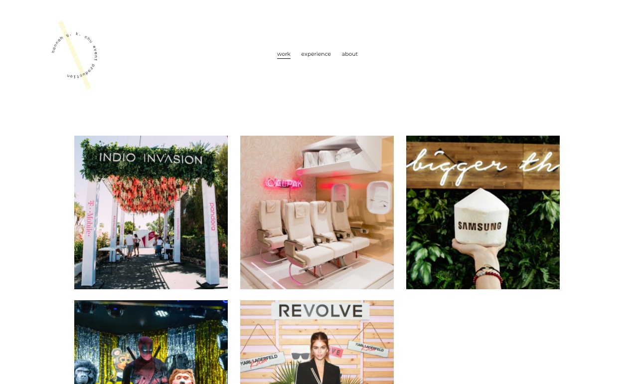
April 2020
Client: Hannah Chu
Exploring branding and logo work for Hannah Chu, Event Producer.
Client asked for a minimal aesthetic with soft pastel tones to offset the color photos going into her portfolio. I gave her three different “mood boards” of designs, and after she narrowed down her choices we revised colors, size, and displayed text.
01 — Minimal and Modern
Clean, minimal, and modern design. I tried to incorporate
calligraphy into a few designs, per the client’s request.
01 — Retro + Illustrated
Exploring a more retro branding with calligraphic typefaces like Lydian.
Using illustrations to soften overall design. Inspired by Palm Springs / desert.
Clockwise: a motel door/room card, book cover of Dune, terracotta vase,
sticker or neon sign, and a motel key tag.
03 — Bold
Bold and clean sans serif in playful shapes.
More youthful and remniscient of streetwear brands.
The Finished Logo
The client chose a logo from the first moodboard.
From there, I changed the color of the bar, kerning, and
the text displayed.
March to April 2020
Client: Juny FilmExploring branding and logo work for Juny, video production.
Clients asked gave me their Instagram to look at their previous work, and asked me to explore sans serif options for the logo. The branding is youthful, exploratory, bold, contemplative, and urban.
First Round / Ideation
I explored a few different ideas to figure out which direction they wanted to go in.
01. A blackletter typeface, in a more streetwear-inspired look.
02. An exploration of the symmetry and similarities of the letters in “JUNY”.
03. Typefaces that I thought matched their brand really well,
such as a wide set sans serif of varying weights.
04. My own personal distortions of a calligraphic sans serif.
Second Round
After receiving feedback on which logos they liked best, as well as what
specifically they liked and didn’t like about each, I continued with two of the four ideas.
Below are the deeper dives into each.
Third Round
Deciding to go with a wide set typeface, we looked at different weights together.
As well as if the logo should be filled or outlined.
Fourth Round
Altered the descender of the “J”, playing around with the angle.
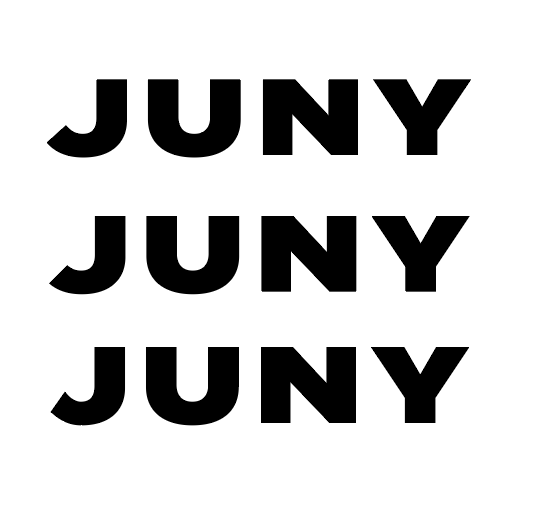
Finished Product
As the logo will be displayed over video, the clients requested that the final logo
be given in white! Here it is below:

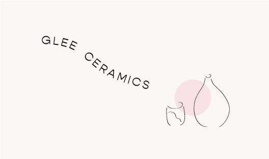
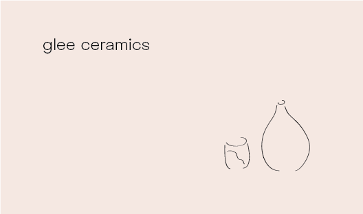
October 2019
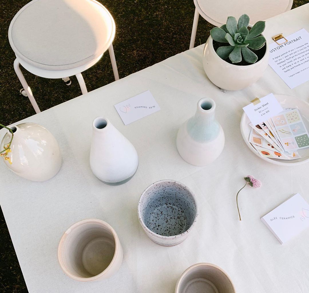
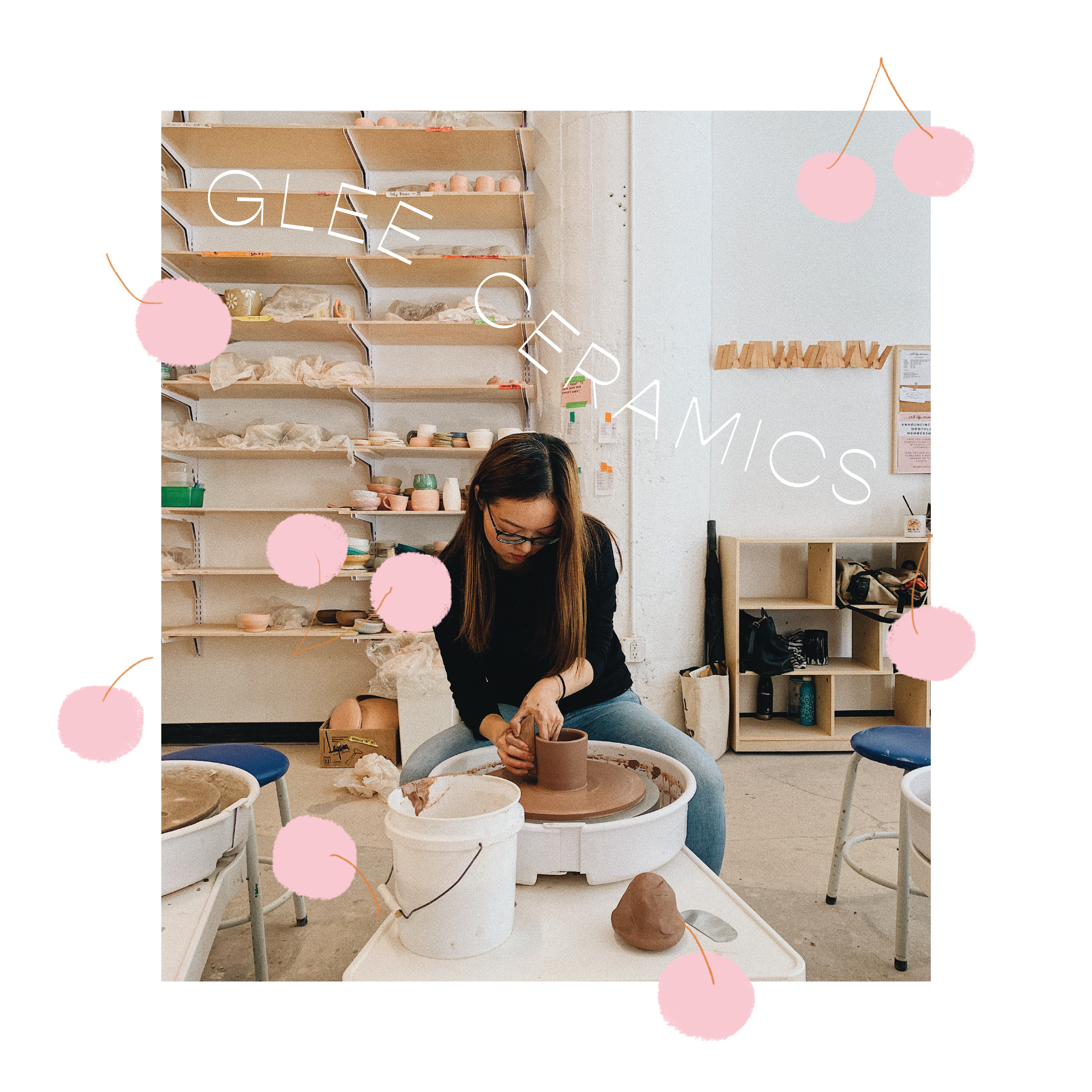
Client: Glee CeramicsExploring branding and business card designs for Gina of Glee Ceramics, a ceramicist in Los Angeles. These were printed for her first ceramics show, to pass out to customers and potential wholesale clients. Gina’s ceramics are minimal and modern, and colored in soft, muted tones. Her personal Instagram (in which she markets her ceramics) is minimalist, clean, and feminine.
Exploration
Sent over a few front and back designs.
From there, Gina picked two that she liked!


Finished Product
(1) The bottom card is the chosen final design.
(2) The cards displayed on a table at Renegade Craft Fair
(3) A screenshot of a promo video I created for Gina.
![]()